
5 December 2017
The Fairer Finance guide to clear design


This year we’ve awarded our Clear & Simple Mark for the very first time. Documents ranging from Back Me Up’s policy booklet to Co-op’s funeral plan terms and conditions have achieved the high standards of our award.
We established the award to recognise the providers that put the effort in to make their terms clear and understandable. Here we set out the key things we look at in our analysis, and what providers can do to stand a chance of passing it.
Spacing
Any good designer will tell you how important spacing is. No matter how good the content, if your document is crammed with information it’s going to be off-putting. Having the right amount of white space in your document will instantly make it more visually appealing.
And it’s not just soft on the eyes - correct spacing actually increases reader comprehension. Considering the nature of financial documents, you want to do all you can to help the reader understand them.
We aim for around 400 words per page of A4 to keep things from getting cluttered. Admittedly, there’s not much science behind this number. Its wisdom we’ve acquired after doing this for years.
Look at this example from QuoteMeHappy:
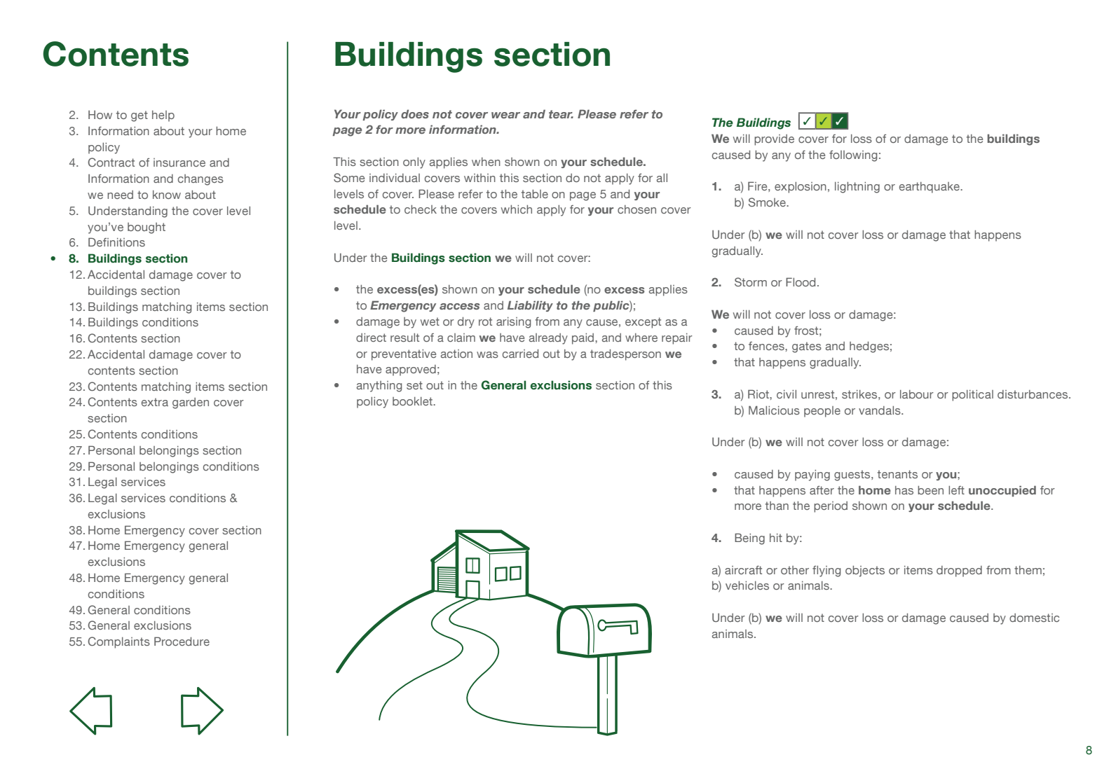
Averaging 359 words per page, there’s plenty of room for the information. On top of this, there’s enough space for a rolling contents on the side. And there’s enough room for an image, which breaks up the monotony of the text.
Colours
It sounds simple, and that’s exactly why we’ve included it. It’s one of the easiest things you can do to your documents to make them instantly more appealing. Straight black and white is off-putting to the reader.
In particular, people with dyslexia find black and white text more difficult to read. As one in ten people in the UK have dyslexia, that’s an enormous number of customers not being served properly.
Additionally, colour coded documents are easier to navigate, and easier to understand. Mark out clearly which sections are which, and which sub headers belong where.
The reader is not going to sit down with these documents like they’re a novel. They’re manuals for them to flick through when needed. So, the more you can use colour to clearly section off relevant information the better.
Font Size
An appropriate font size is critical for all readers, but especially for those with visual difficulties. We recommend using at least 10pt font so the text is big enough to be read. We’ve seen documents with font that’s 6pt in size.
If you’re having to make the font that small to avoid your document being 100 pages long, try to cut the word count instead.
Tables/infographics
Graphics are a great way to explain difficult information. And considering how much difficult information is in financial documents, they’re definitely not used enough.
It’s tempting to stick to plain text. But there’s nothing to stop these documents being full of tables and infographics to clearly explain the information. The function of these documents is largely to explain the product to the reader. Take the steps needed to maximise this - no matter how ‘untraditional’ it might seem.
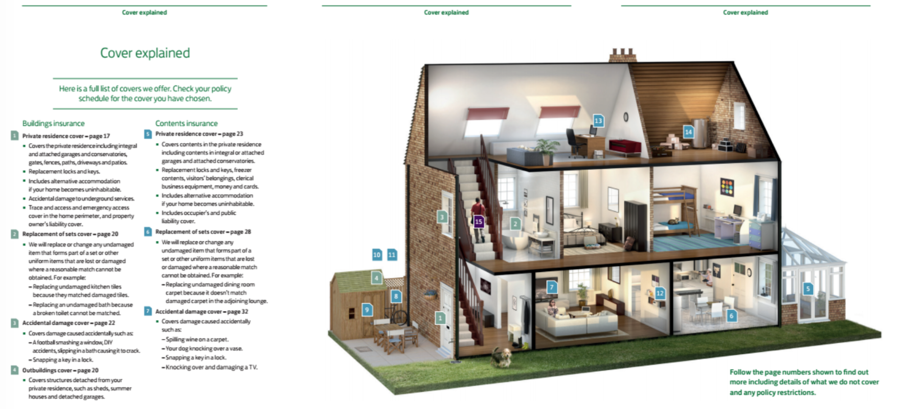
Here’s a great example from Lloyds, detailing the key product information in a clear, understandable way:
Navigation Tool
Again, terms and conditions aren’t best understood if they’re read like novels. And the average customer isn’t going to sit down and do that anyway. To help the reader flick through to the exact information they need, use a navigation tool.
This can be something simple. ‘Rolling headers’ clearly define which section the information relates to. See this example from Churchill:
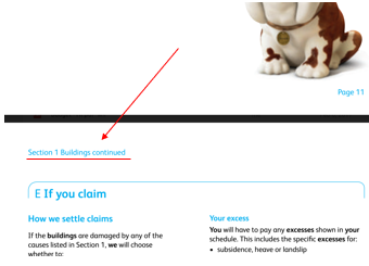
Something as simple as adding in an extra heading, such as ‘Section 1 Buildings continued’, on each page aids navigability.
Another trick to try if the document is to be viewed online, is to use an interactive navigation tool.
See this example from General Accident:

The clickable contents help the reader scroll through the document, while also reminding the reader which section they’re on.
Line Spacing
Here’s another simple thing that makes a world of difference. Line spacing is the gap between lines in text. Anything above or below 1.25-1.45em impairs reader understanding, so be sure to stick to this range.
We’ve never seen a document that’s over 1.45em, but plenty that are below 1.25em. Line spacing is vital to ensure documents are readable. Again, if you can’t increase line spacing without ending up with an enormous document, try cutting the word count instead.
Spatial Positioning
Its known that a decent amount of white space works wonders. But it’s equally important to organise the information within this space.
Relevant information should be kept together, and spaced apart from non-relevant information. Aim to create a ‘hierarchy of information’ in the document.
The simplest way to do this is to double-space between the end of a section and the start of another. At the same time, single-space between the start of a section and the information that follows it.
But there’s a whole range of ways that information in a document can be organised. Look at this example from Direct Line:
The relevant information is grouped together. There’s double-spacing between sections, and single-spacing within sections. Immediately the reader can see a hierarchy in the information, and this greatly aids readability.
Conclusions
The key take-home message in all this is to think big. The traditional black and white, ‘block text’ terms and conditions may seem the right way to do things. But the function of these documents is to explain the product to the customer. Take the steps needed to maximise this function.
According to a comprehensive 2016 report from Label Insight, increased transparency results in increased trust. Customers will hardly trust you if your documents read as if they’re trying to obscure the information.
The finished document may end up looking a world away from ‘traditional’ terms and conditions. But if the customer understands the product better, this can only be a good thing.
About the author